Tale of Three Bathrooms
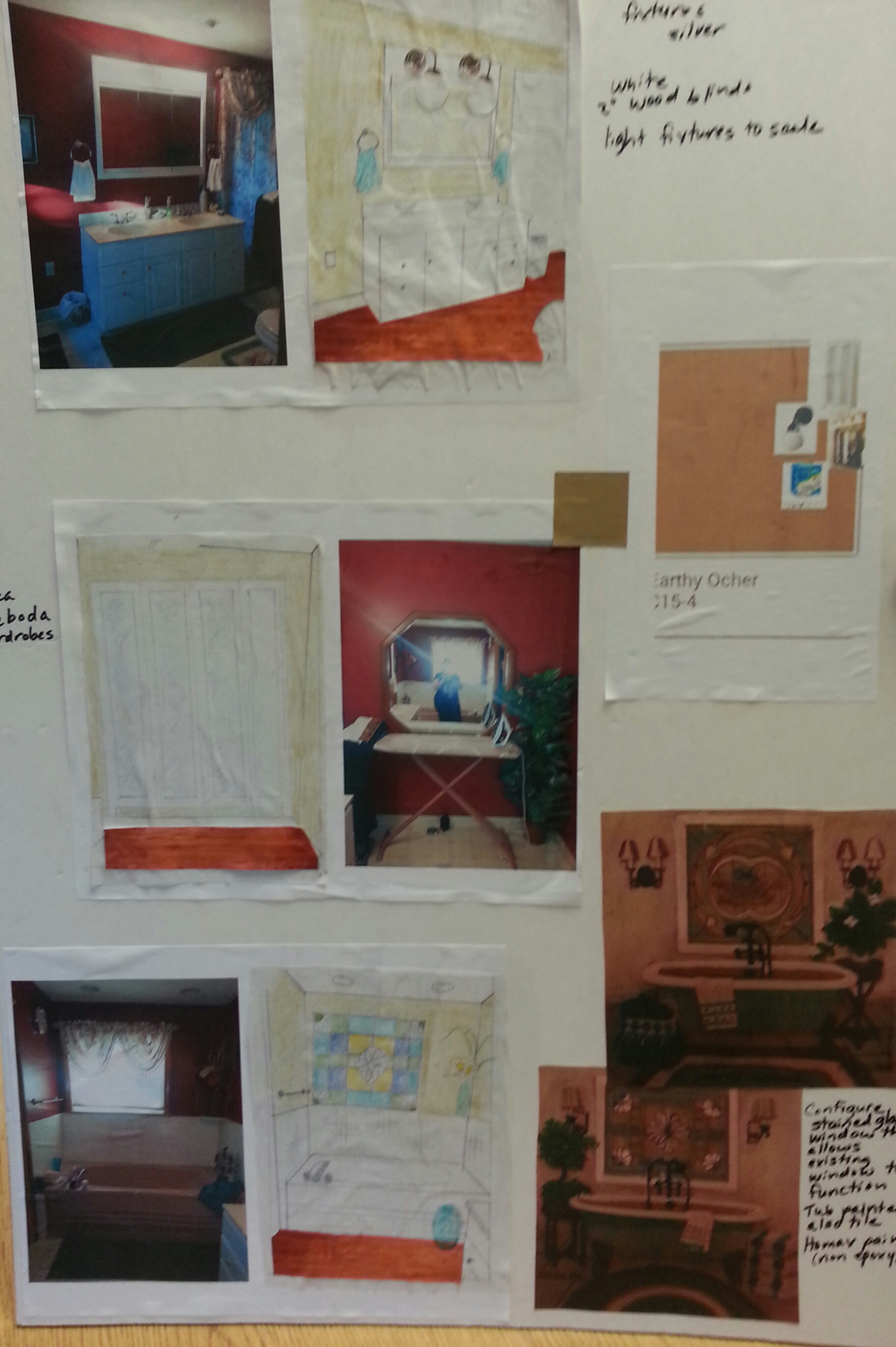
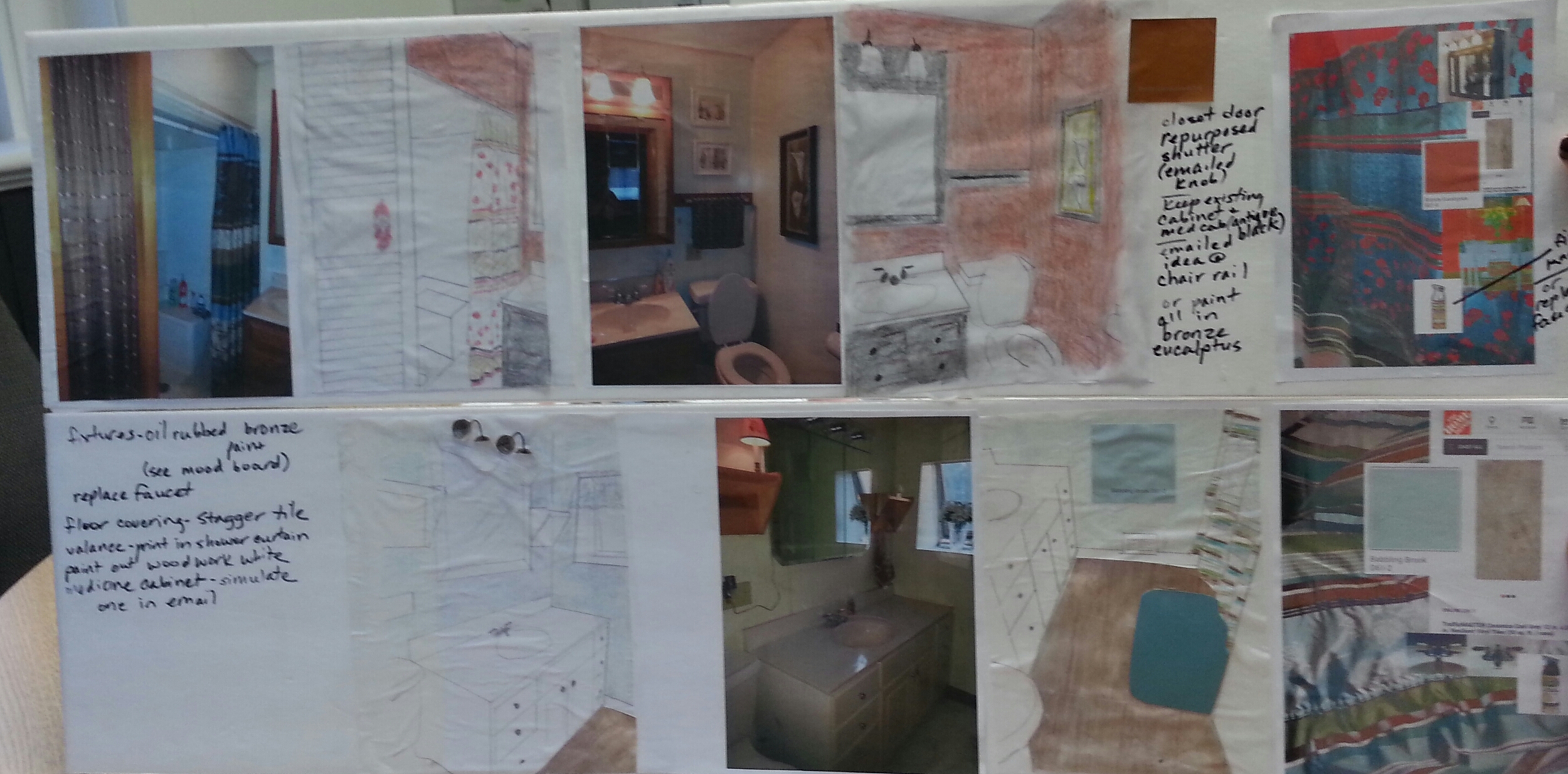
Patty and Jim DeRosa had me back to update not one, not two, but three bathrooms in their home. It all starts with a plan. First I drew up my ideas for their bathrooms and met with Patty for her approval. She and Jim liked the designs and the work proceeded.
I'm pleased to say that the end results of the rooms did not stray too far from the original design. Click on the design image to see both design boards.
Let's start with the Master bath.
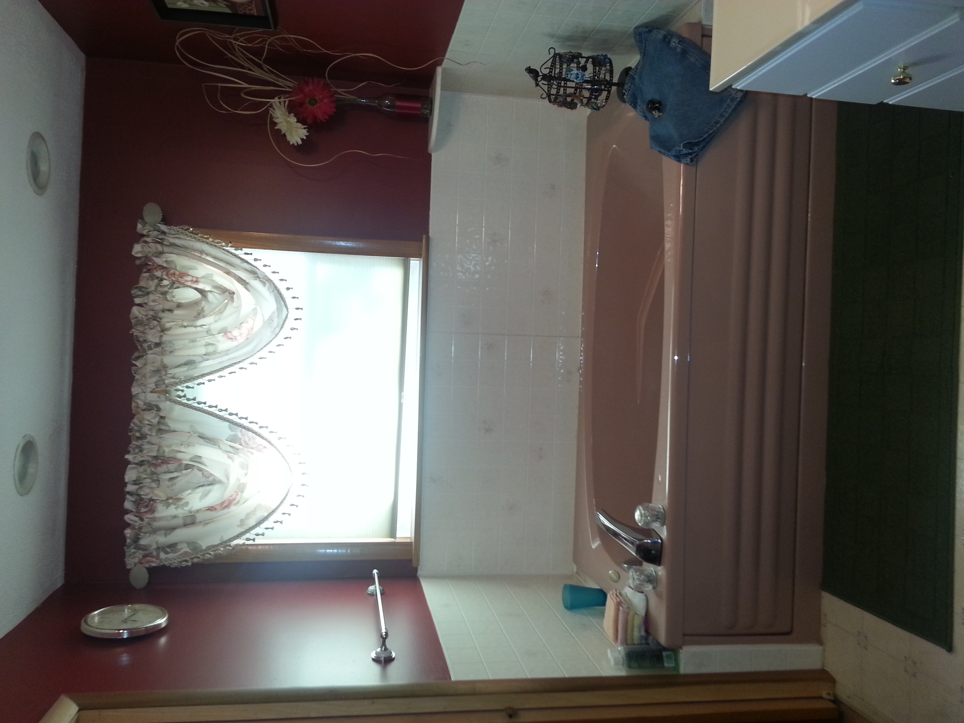
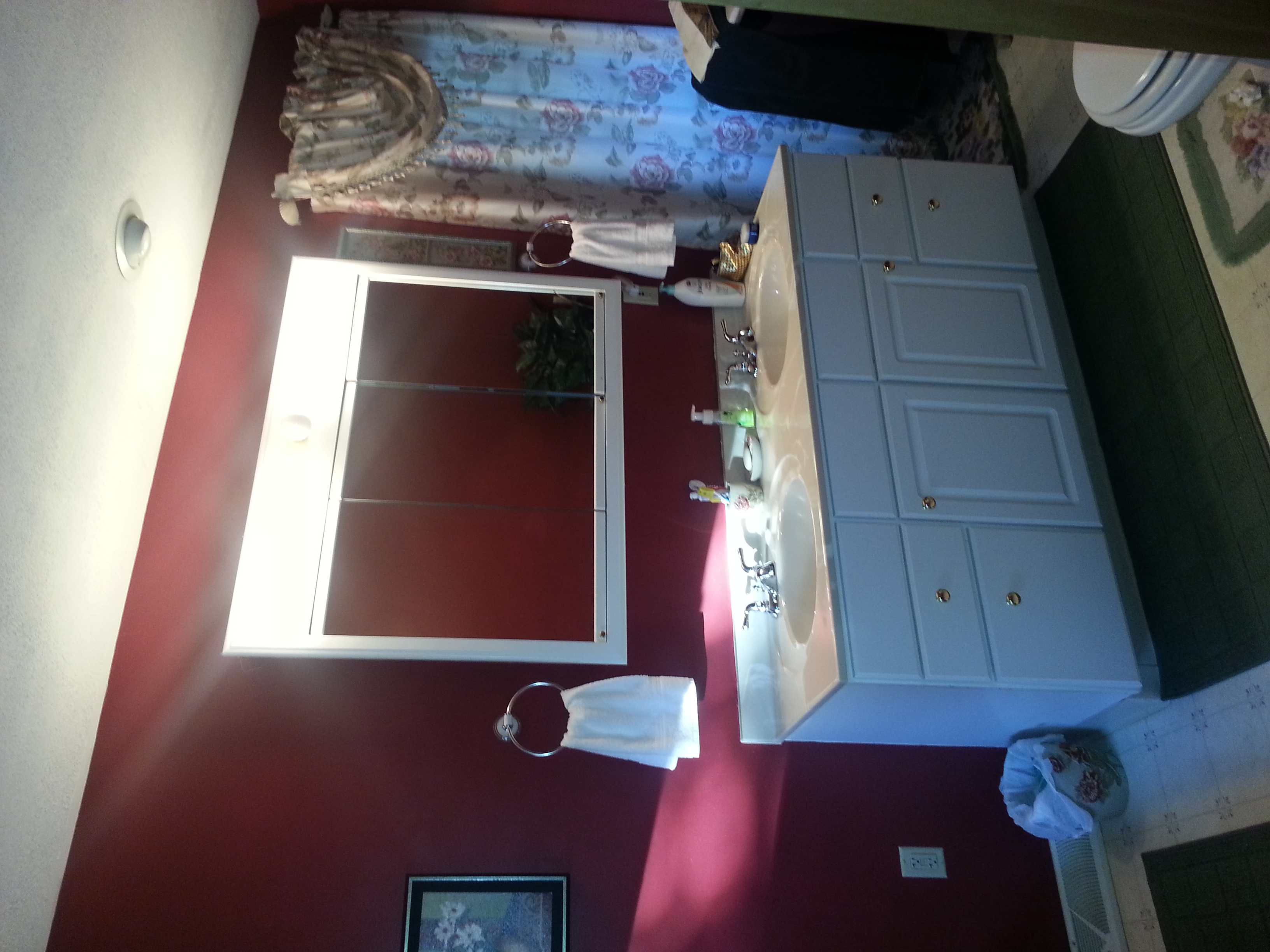
The Master bath had a pink Jacuzzi and lighting on the medicine cabinet that dated the room. Jim disliked the deep red color so a neutral tan was selected. White became the complimentary color starting with the tub. No, the tub was not replaced, but painted with special paint designed for tub and tile. The medicine cabinet got updated with new lighting and all the hardware was painted as well to a silver color. The floor got covered in a floating vinyl plank and the wall opposite the tub got outfitted with two large cabinets from IKEA for storage. The curtains were replaced with a 2" white wood-look blinds. A repurposed chandelier was added to the design for some charm over the tub. The window over the tub got a Gallery Glass paint treatment to retain the window's functionality.
This picture shows the tub before the faucets were replaced.
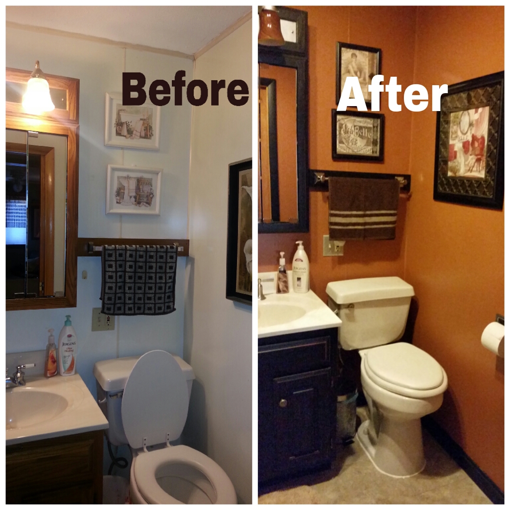
On to bathroom number Two. This small bath sits off the living room. The walls are covered in a panel board. To change the color, a bonding primer was used and then painted with this beautiful butterscotch. The oak vanity set was antiqued and the shades were replaced on the lights. A new 12" x 24" tile was used on the floor and a repurposed shutter replaced the existing curtain on the linen closet beside the shower. The shower curtain from the upstairs made its way downstairs and was embellished with ribbon sewn along some of the stripes. A new picture purchased by Patty is on one wall, while her existing pair of pictures behind the toilet were redone with internet images embellished with ribbon, tape and metal pieces.
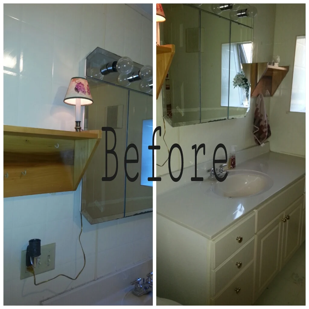
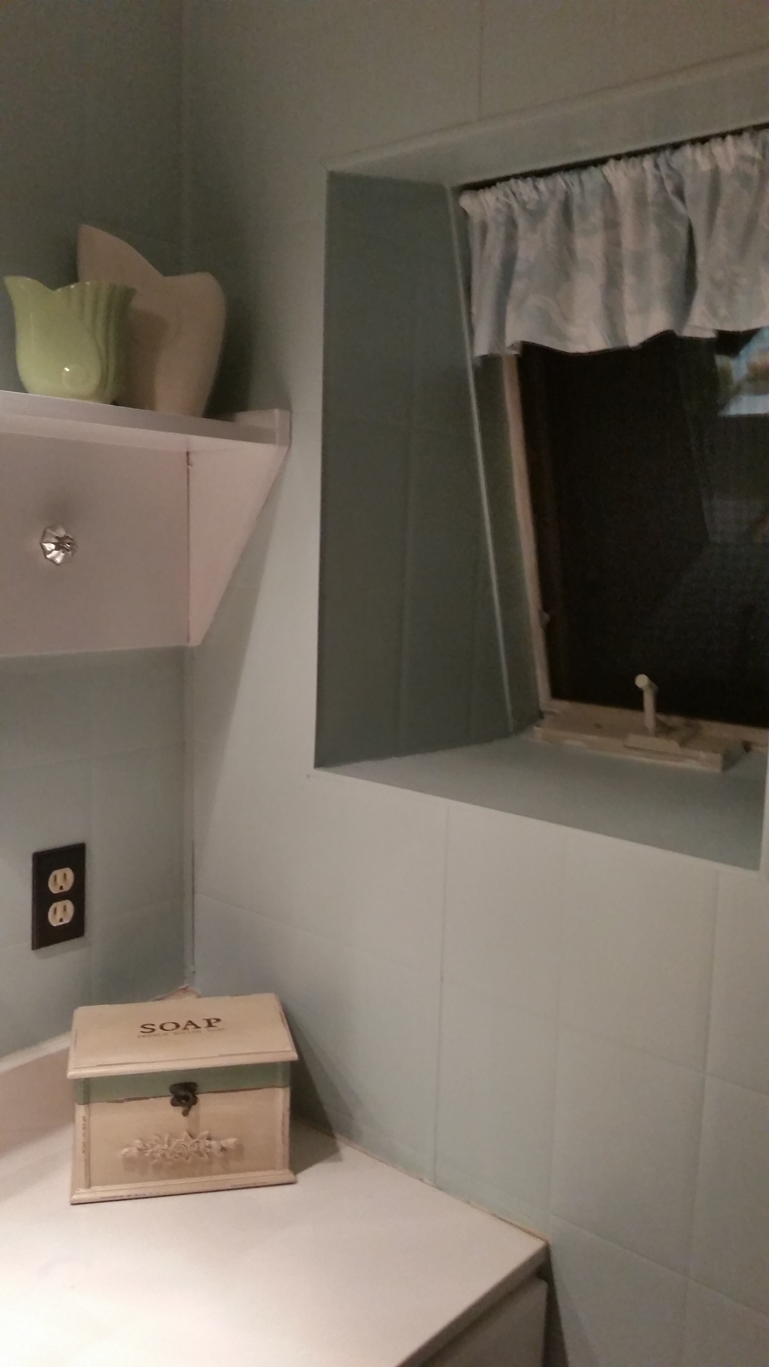
Both Patty and I both agree that Bathroom 3 might be our favorite. The paneled wall took on a spa-like blue color and the floor was tiled in the same 12" x 24" tile as the bathroom 2. There were natural wood shelves in the room and another outdated medicine cabinet. The hardware went to oil-rubbed bronze. Patty and Jim purchased a new faucet set which is soon to be installed.
Notice the angled edge of the medicine cabinet at the top and bottom. These features along with the light, dated the room. The section of mirror with the lights on was removed by Jim. We removed the doors and I sent them off to Allegheny Glass who was able to cut off the angled part of the mirror and door, leaving a flat edge under which a row of cubby shelves were placed. The light fixture came from IKEA. The black fixture benefited from some strategically placed bronze acrylic paint.
The shelves which are now painted white got some style with some mismatched knobs.
